Welcome to Topaz for Vue Projects ;)
UI component library based on tailwindcss, UnoCSS, heroicons. Topaz is a MIT licensed project that is developed and maintained by Antônio Zanotti.
Install Topaz Vue
npm i -D topaz-vue
Install UnoCSS (instructions here)
Update the main.ts file:
import "@unocss/reset/tailwind.css"; import "virtual:uno.css";
Update the uno.config.ts file:
import { defineConfig } from "unocss"; import presetTopazVue from "topaz-vue/src/unocss-preset-topaz-vue"; export default defineConfig({ presets: [presetTopazVue()], content: { filesystem: ["./node_modules/topaz-vue/**/*.vue"], }, });
That's all! Topaz's components can be imported in your .vue files.
<script setup lang="ts"> import {TzButton} from "topaz-vue"; </script> <template> <TzButton label="Button" /> </template>
UnoCSS Preset Topaz Vue
You can customize colours and font sizes, just update the uno.config.ts file.
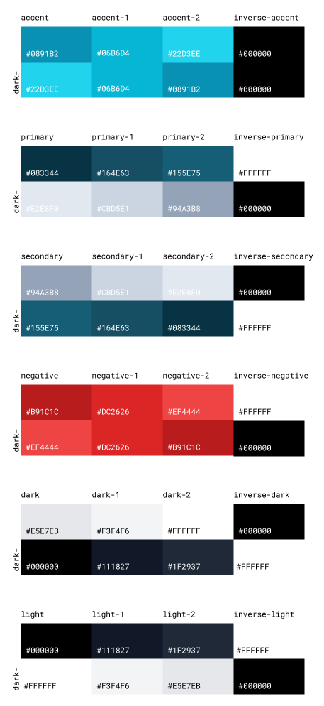
import { defineConfig } from "unocss"; import presetTopazVue from "topaz-vue/src/unocss-preset-topaz-vue"; export default defineConfig({ presets: [presetTopazVue()], content: { filesystem: ["./node_modules/topaz-vue/**/*.vue"], }, theme: { fontSize: { c1: "10px", c2: "12px", c3: "14px", c4: "16px", c5: "20px", c6: "24px", c7: "32px", c8: "36px", c9: "40px", c10: "48px", c11: "64px", c12: "96px", }, colors: { accent: "#0891B2", "accent-1": "#06B6D4", "accent-2": "#22D3EE", "dark-accent": "#22D3EE", "dark-accent-1": "#06B6D4", "dark-accent-2": "#0891B2", primary: "#083344", "primary-1": "#164E63", "primary-2": "#155E75", "dark-primary": "#E2E8F0", "dark-primary-1": "#CBD5E1", "dark-primary-2": "#94A3B8", secondary: "#94A3B8", "secondary-1": "#CBD5E1", "secondary-2": "#E2E8F0", "dark-secondary": "#155E75", "dark-secondary-1": "#164E63", "dark-secondary-2": "#083344", negative: "#B91C1C", "negative-1": "#DC2626", "negative-2": "#EF4444", "dark-negative": "#EF4444", "dark-negative-1": "#DC2626", "dark-negative-2": "#B91C1C", dark: "#E5E7EB", "dark-1": "#F3F4F6", "dark-2": "#FFFFFF", "dark-dark": "#000000", "dark-dark-1": "#111827", "dark-dark-2": "#1F2937", light: "#000000", "light-1": "#111827", "light-2": "#1F2937", "dark-light": "#FFFFFF", "dark-light-1": "#F3F4F6", "dark-light-2": "#E5E7EB", "inverse-accent": "#000000", "inverse-dark-accent": "#000000", "inverse-primary": "#FFFFFF", "inverse-dark-primary": "#000000", "inverse-secondary": "#000000", "inverse-dark-secondary": "#FFFFFF", "inverse-negative": "#FFFFFF", "inverse-dark-negative": "#000000", "inverse-dark": "#000000", "inverse-dark-dark": "#FFFFFF", "inverse-light": "#FFFFFF", "inverse-dark-light": "#000000", }, }, });
Design Point of View
The components was designed to work with these variants:
Light Theme:
- accent: colors for greatest emphasis.
- primary: colors for medium emphasis.
- secondary: colors for lowest emphasis.
- negative: colors for emphasizing actions that can be destructive.
- dark: light colors.
- light: dark colors.
- inverse-accent: text color above a accent background.
- inverse-primary: text color above a primary background.
- inverse-secondary: text color above a secondary background.
- inverse-negative: text color above a negative background.
- inverse-dark: text color above a dark background.
- inverse-light: text color above a light background.
Dark Theme:
- dark-accent: accent colors on dark theme.
- dark-primary: primary colors on dark theme.
- dark-secondary: secondary colors on dark theme.
- dark-negative: negative colors on dark theme.
- dark-dark: light colors.
- dark-light: dark colors.
- inverse-dark-accent: text color above a accent background on dark theme.
- inverse-dark-primary: text color above a primary background on dark theme.
- inverse-dark-secondary: text color above a secondary background on dark theme.
- inverse-dark-negative: text color above a negative background on dark theme.
- inverse-dark-dark: text color above a dark background on dark theme.
- inverse-dark-light: text color above a light background on dark theme.
This color palette is ordered by contrast between variants (accent, primary, secondary...) and also shades (default, 1, 2).

You can use a color contrast checker to help calculate the contrast. The colours dark-2 and dark-dark-2 are used for background.
Features
Components
Browse the stories in the sidebar menu to know the different Vue components in the Topaz catalog and see usage examples for every component. You can try change props and share the result with others, just copy the URL anytime.
Dark and Light Theme
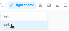
 If you want to simulate how the component looks in dark theme, you can switch the theme in the toolbar. It uses class strategy of tailwindcss.
The primary and secondary variations swap with each other. The black and white variations swap with each other.
Responsive
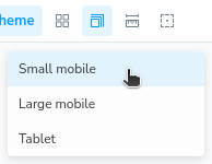
 If you want to see how the component looks in different screen sizes, you can switch the screen size in the toolbar. Some components on screens larger than or equal to 1024px will be ~20% smaller than its mobile version.